Posts

Showing posts from April, 2013

NFL Drafts - Visualized

Image
The NY Times goes through the drafts since 1995 (screen-cap below, go to the site for the interactive version! ) and figures out what we already new, viz. With notable exceptions, the first overall pick has, on average, proved to be the most productive player in the class. Nearly two-thirds of the most productive players drafted since 1995 were selected in the first round Mind you, we're not talking Alan Greenspan here (" With notably rare exceptions, Germany remained largely at peace with its neighbors during the 20th century. ") - its just very, very unlikely...

SXSW Panel Names - Visualized

Image
TNR does the heavy lifting here, analyzing the hipster-technerd swamp that is SXSW , and categorizing the panel names appropriately. My favorite? Contrarianism + Self-Help =:= Seven Ways to Fail Magnificently

(Movie) Time Travel - Visualized!

Image
Herewith, in one handy-dandy flow-chart from Mr. Daillard , everything you need to know about Movie Time Travel.  Do click to embiggen it quite a bit... (hat-tip FlowingData )

Fictional Villains - Visualized by size

Image
Nathan Yau @ FlowingData puts together this chart on fictional villians by size. Enjoy! (click to embiggen...)

Gender Balance in Conferences - Visualized

Image
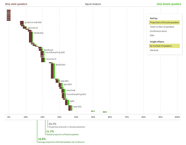
Moritz Stefaner started tracking male vs. female speakers at conferences that he went to, and that evolved into this handy-dandy chart on gender balance in conferences on data visualization (handy!), creative code, and information graphics . The bottom line - its better than I expected, but seriously, that is not saying much (the Erlang / Functional Programming / NoSQL world is heavily skewed towards male speakers...). Here hoping for a far more equitable future... (click to embiggen. Better yet, go to the original for the fully interactive version)

Terror Attacks in the US - Visualized

Image
The Guardian parses through the Global Terrorism Database , and charts the results above. Some important caveats - these are a count of attacks , not of impact   not a count of fatalities The second point is particularly relevant - you have some attacks (9/11) with large fatalities. All that said, it is important to note that, in the end, attacks are quite rare - it is worth turning it over to Bruce Schneier here As the details about the bombings in Boston unfold, it'd be easy to be scared. It'd be easy to feel powerless and demand that our elected leaders do something -- anything -- to keep us safe. It'd be easy, but it'd be wrong. We need to be angry and empathize with the victims without being scared. Our fears would play right into the perpetrators' hands -- and magnify the power of their victory for whichever goals whatever group behind this, still to be uncovered, has. We don't have to be scared, and we're not powerless. We actual...

Gentrification - Visualized

Image
Brought to you by Jen Sorensen . Note that the last panel is based upon what is happening in London ...

Spreadsheets - Causing Unemployment in Europe since ...

Image
I'll let CEPR just say this That's the question millions will be asking when they see the new paper   by my friends at the University of Massachusetts, Thomas Herndon, Michael Ash, and Robert Pollin. Herndon, Ash, and Pollin (HAP) corrected the spreadsheets of Carmen Reinhart and Ken Rogoff. They show the correct numbers tell a very different story about the relationship between debt and GDP growth than the one that Reinhart and Rogoff have been hawking. Just to remind folks, Reinhart and Rogoff (R&R) are the authors of the widely acclaimed book on the history of financial crises,   This Time is Different . They have also done several papers derived from this research, the main conclusion of which is that high ratios of debt to GDP lead to a long periods of slow growth. Their story line is that 90 percent is a cutoff line, with countries with debt-to-GDP ratios above this level seeing markedly slower growth than countries that have debt-to-GDP ratios below this lev...

How to avoid paying taxes - Visualized

Image
Ok, this only applies if you are significantly wealthy. D'you have - at least - three commas in your checking account balance?  If not, don't bother reading this... Source: TopAccountingDegrees.org

Health Care in America - Visualized

Image
From the Department of Depressing Statistics - when compared to most (all?) other "first world" countries, We spend more per capita (and as a percentage of the GDP) We have more deaths (as a percentage of the population!) We have the lowest life expectancy We're the worst when it comes to diabetes and a whole bunch more. Herewith the data as an infographic Image source: www.bestmasterofscienceinnursing.com

The Fattening of America - Visualized

Image
The Atlantic has a great piece on obesity in America from 1985 through 2010 (FWIW, "obese" basically tends to translate to "BMI > 30". Whats particularly bad though is that there are no states w/ obesity rates below 15% . Ouch.

Thatcher's Legacy - Visualized

Image
From The Guardian , we have this infographic showing the evolution of Industry, the Economy, and society in general since then. The below is just a screen-grab, go to the original for the gory details ...

Bob Dylan - Who knew?

Image
Brought to you by John Kovalic

Baseball Ticket Prices - Visualized

Image
David Yanovsky does yeoman's work @ Quartz , wading through baseball ticket pricing. Most of this stuff is pretty obvious, but there are still some fairly wacky nuggets in there. Least expensive ticket - $8.55 for the White Sox @ the Indians 12 teams in 2012 had no home tickets resold for > $100 The Royals have the cheapest tickets of the lot (well, d-uh) And in a continuation of the d-uh, the Mariners and the Rockies are pretty damn cheap too Herewith a handy-dandy chart encapsulating a bunch-a data.  I'd strongly recommend going to the original to read the entire article  

IRA Contributions - Visualized

Image
From Bankers Anonymous comes this stellar infographic showing you your decision tree associated with your 2012 IRA contribution. My favorite part is, clearly Do you somehow have between $20 Million and $100 Million in your IRA? Yes --> You're Mitt Romney.   hat-tip Barry Ritholz (click to embiggen. A lot...)

North Korea - Visualized

Image
The Guardian - like Wolverine - is the best at what they do, i.e., visualize data.  In this particular case, they've done the CIA WorldFactbook data on North and South Korea proud. The bottom-line? North Korea is basically a disaster-zone (but you knew that, right?) These are just screen-grabs.  Go to the original for the fully interactive version

Bankers vs Pirates

Image
From M.Wuerker @ Politico (hat-tip Barry Ritholz ) That is all...

Billionaires on Earth - Visualized

Image
From Jess @ visual.ly comes this hand visualization of all the Billionaires on Earth. And, in case you're wondering why Oprah is specifically called out, its 'cos shes (clearly) the only female black billionaire out there...

Ideas - Categorized

Image
InformationIsBeautiful brings us this Taxonomy of Ideas on an X-Y chart, a classification if you will.  I particularly like the top-left quadrant - Dysfunctional, yet well conceptualized :-) Hat tip Barry Ritholz (click to embiggen)

Its not just #Kitteh pics that are cute...

Image

The Brooklyn Survival Kit

Image
Eugenji Sukharenko brings us what must truly be the ultimate Hipster Starter Kit - something that no true Brooklyn-ite can be without (hat tip +Yurii Rashkovskii )

(American) Kitchen Measurements - Visualized

Image
Do you know how many table-spoons in an ounce? How many ounces in a foot? How many feet in a horsepower? Do these units even begin to make sense? Seriously, WTF is it with the stupid measurement system we have here in The Greatest Country In The World ™ ? Life is so much simpler in metric.  Just add/remove a 0 everywhere, and remember that 1kg = 1 ltr of water.  Brilliant, simple and perfect. But, just in case you actually need to follow some goofy recipe, herewith a simple visualization that shows it all from the brilliant minds at S.B. LattinDesign

The Scale of the Universe - Visualized

Image
Cary & Michael Huang @ htwins.net bring you this remarkable interactive visualization of the universe, from the very small to the very big.  Sometimes you just need to see things at scale to realize how big (or not big, for that matter) things are!! Note The above is an image.  I've embedded the flash below, but I'd recommend going to the original to see it in all its glory You need a more recent version of Adobe Flash Player . Other languages — Back -->