Posts

Showing posts with the label Data Visualization

Pie Charts - Just Say No

Image
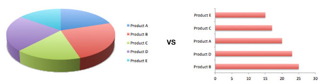
For those who have known me for a while, my antipathy towards pie-charts (and donut charts!) should be nothing new FWIW, it’s not something off the cuff - pie-charts are,  almost always  better off being replaced by something different (bar graphs being the obvious replacement). Why? Because Quantity is represented by angles and humans are   VERY   bad at identifying differences in angles (87 °   vs 82 ° ? Labeling slices ends up confusing stuff even more Small percentages (which might be important) get goofy Anything above 2-3 items in the pie chart are crazy difficult to figure out Don’t get me started on donut charts, that just take all of the above, and make it Even harder to deal with And it’s not just me, Stephen Few ( Perceptual Edg e. Think “grandmaster of all things Visualizaion”. Hell, he, literally, invented the  bullet graph …) wrote the definitive “ DO NOT USE PIE CHARTS ” article back in 2007. And yeah, if you don’t feel like reading the whole...

Interactive Visualization — the Why

Image
/via https://www.slideshare.net/tgwilson/waw-sep2010-datavisualizationwithnotes Is your Visualization effective? Yes, yes, this is a totally loaded question. After all, WTF does “ effective ” even mean? Well, if you’re using it to understand data, did it work? OTOH, what if you’re trying to explain it to somebody else? You may have to make it easier to comprehend, or more accessible (you’re not color-blind, but what if they are?), etc. And how do you make sure that in doing so for Bob, you didn’t foreclose the ability to explain it to Carol (who, unlike Bob,  really  sweats the small stuff). The common point underlying the above is — “ Why do I, the end-user, give any f**ks about this? ”. And that tends to be issue. Static visualizations, by their very nature, represent a single viewport into the data, the one baked into it’s current representation. And that’s where  Interaction  comes in. An interactive visualization changes the lens with which the data ...

Uncertainty, and the Visualization thereof

Image
Nathan Yau   has   a nice roundup of the different ways in which we can show #Uncertainty , including   Ranges ,   Distributions ,   Multiple Outcomes , and   Obscurity . Wait   what ? Obscurity ? WTF is   Obscurity   in this context? It’s actually quite straightforward — the more uncertain the data, the more difficult it is to see — which you can do via   blurring ,   transparency ,   colors , etc. — something that sounds really obvious in retrospect, no? 😌 The upside is clear — reliable data is made prominent. The downside, well, it has to do with what Obscurity actually   means   to us — do we actually understand gradations? If so, how many levels are feasible — 3 levels of blurriness? 13? Or is it just   “blurry or not”   in our minds? It turns out that there is surprisingly little research into this 😞 Anyhow, a pretty cool tool for #Visualization , and something I hadn’t seen before… ...