Posts

Showing posts from March, 2013

50 Years of Doctor Who - Visualized

Image
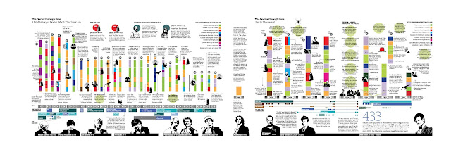
The Guardian is - quite possibly - the leader in " Data Visualization as Journalism ", and their take on the Doctor through the years is no exception.  This work by their designer Kari Pederson is comprehensive and spectacular. Click the below to embiggen (a lot), or better, go here for the pdf )

Coffee - (un)intuitively Visualized

Image
From Nathan Yau comes this breakdown of the ingredients in whatever this East London coffee shop is selling. WTF? Seriously, WTF? How are we supposed to know what these are? Maybe red is water, and green is an espresso shot? I guess the whole thing is a bit of an a-la carte thing, but you'd hope that there would be something that sez. " This is a latte , that , is a macchiato " etc.   Then again, maybe that is the point, and we're supposed to guess...

Porn Stars and Careers - Visualized

Image
What happens when you spend 6 months analyzing 10,000 porn stars and their careers ?  Well, apart from creating what is arguably the easiest setup line in the history of setup lines, you also end up with a trove of data, and one massive infographic, and some fairly surprising statistics such as the most common hair color (brown) The most common female role (Teen, followed by MILF) The most common names (Nikki Lee and David Lee. Why? No clue...) and a whole bunch more Anyhow, the infographic is located here (its huge, so I'm not going to bother embedding it)

Irrational Nonsense - Visualized

Image
Crispin Jago wades through the crapfest of irrational nonsense , and pulls it all together into a neat - and startling - Venn Diagram.  My favorite bit is what is at the intersection of it all :-) However as such nonsensical beliefs continue to evolve they become more and more fanciful and eventually creep across the bollock borders. Although all the items depicted on the diagram are completely bereft of any form of scientific credibility, those that successfully intersect the sets achieve new heights of implausibility and ridiculousness. And there is one belief so completely ludicrous it successfully flirts with all forms of bollocks. Religious Bollocks ∩ Quackery Bollocks ∩ Pseudoscientific Bollocks ∩ Paranormal Bollocks = Scientology Click to embiggen quite a bit

"Learn You Some Erlang For Great Good" - a review thereof

Image
Disclaimer #1 - I was asked to review this book, and no starch press sent me a review copy. Disclaimer #2 - The erlang world is somewhat small, and I happen to know the author. Disclaimer #3 - I helped proof-read large swathes of the book. (Ok, that one isn't a disclaimer - it was an #AutoPlug. Sue me). When you really get down to it, books tend to come in two types Reference Books : These are the ones that you pick up when you want to learn something, or more likely, when you need to look something up.  The classic example, of course, is The Camel Book (to me at least.  I find perl to be quite useful , and the perfect counterpoint to erlang) Fun to Read Books : These are the ones that you read 'cos, well, they're fun .  Anything by Jasper Fforde , Iain Banks , or Terry Pratchett counts.  And yeah, the intersection between categories (1) and (2) is basically the null set .  Mind you, if your idea of entertainment is curling up in front of the fireplace w

The Sun - Visualized

Image
The Guardian pulls together some information from NASA to show us the myriad ways in which they look at the Sun - Surface movement, Magnetic field polarity, Coronal flares, and oh so much more. Its visually brilliant (heh, a pun), and awe-inspiring. Click on each to embiggen

The world according to Indians - Visualized

Image
via Siddharth Singh (hat-tip Ajay Bhardwaj) I'm a particular fan of the Canada-ization of Nepal (" The 29th State "), though Switzerland (" Shah Rukh Khan dances here ") is a close second :-)

John Snow's Cholera Map - Visualized (again!)

Image
Remember John Snow ? The Cholera guy? The dude who pretty much invented epidemiology?  In case you don't, and didn't check out the Wikipedia link above, he mapped out the incidence of cholera during an outbreak in 1854 , and based on the pattern, deduced that (being clustered around the Broad Street public water pump) cholera was spread by contaminated water. That map is now justifiably famous - and is the one you see to the right (embiggen for its full glory) The folks at The Guardian (who are constantly brilliant at this sort of stuff) have recreated the map using the original data and CartoDB .  I've embedded a screen-grab below, but go to their site for the original. Mapping tools have certainly become quite awesome, no?

Billy Joel can still bring it - who knew?

Image
Billy sing "New York State Of Mind" with Vanderbilt University student Michael Pollack, filmed during "An Evening of Questions and Answers and a Little Bit of Music" at the university in January 2013. Hes great, and Michael Pollack, well, is pretty awesome too... hat tip Bob Lefsetz

The War on Drugs - Visualized

Image
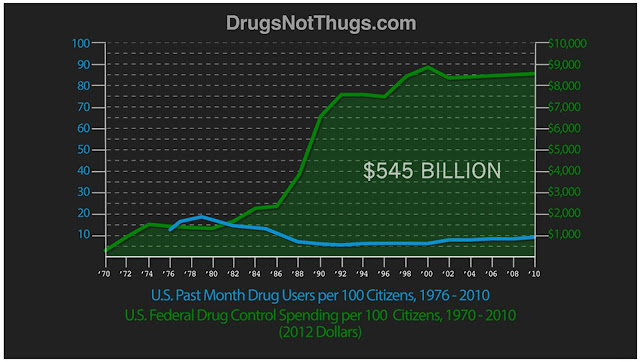
  Matt Groff puts together a chart showing Drug users vs (anti) Drug spending - per 100 citizens . There does seem to be a wee bit of controversy around this, but the basic point is pretty well made. (The above is but a screen-capture. Go check out the original)

Household Net Worth by Race - Depressing

Image
Pew research finds (and the census backs up ) this ridiculously depressing piece of data The median wealth of white households is 20 times that of black households and 18 times that of Hispanic households, according to a Pew Research Center analysis of newly available government data from 2009. These lopsided wealth ratios are the largest since the government began publishing such data a quarter century ago and roughly twice the size of the ratios that had prevailed between these three groups for the two decades prior to the Great Recession that ended in 2009. I really have nothing else to add to this. Sigh.

Commute times in NYC - a #Visualization

Image
It turns out that the US Census does something called the American Community Survey , which provides statistics on all sorts of stuff for pretty much every community in the US (yes. Including Tuscaloosa) One of these is the " Out of State and Long Commutes " survey, which has such delightful factoids as 23.0 percent of workers with long commutes (60 minutes or more) use public transit, compared with 5.3 percent for all workers. Only 61.1 percent of workers with long commutes drove to work alone, compared with 79.9 percent for all workers who worked outside the home. Anyhow, WNYC took this data and mapped it for NYC (well, d-uh), and the results are below.  The bottom line? Manhattan is - not surprisingly - extraordinarily commuter friendly.  I suspect mass-transit :-) c

Papal Probabilities - Visualized

Image
Fascinated by the papal election? Interested in the minutiae of the curia? Or maybe you're just wondering who gets to ride around next in the popemobile? Never fear, DataParadigms has the Pope Probability Tracker set up for you, all nice and shiny , with code on github and all.  As they put it Last week, I set up a scrapper to update the odds hourly from a prominent bookmaker. Given that I had a weeks worth of data, it was time to fire up   iPython   and see the action . The betting lines seem to have stabilized over the last few days. As we get closer and closer to   papal conclave   and the members of the remaining   Cardinal electors   arrive in Rome, the lines should show some movement. . The result is below ( go to the original for the up-to-date info ). And yes, I read " Angelo Scola " as " Anthony Scalia ", and it scared the pants off of me too...

Baby Elephant + Ocean = Cute

That is all...