Posts

Showing posts from January, 2013

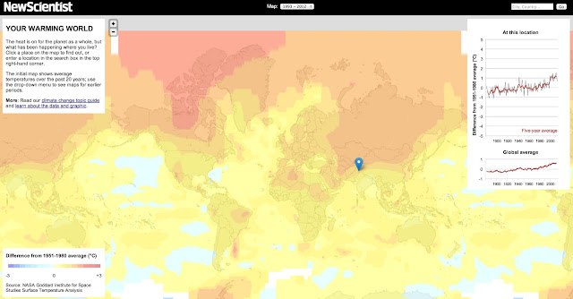
Remittances from Migrants - Visualized

Image
Yet another gorgeous Visualization from The Guardian - showing the flow of money from migrants (in the form of remittances) worldwide. (Note that the above is just the image - for the interactive version, go to the source ) As The Guardian puts it Migrant workers have always sent money home to support family and friends. But in recent years these   remittances , as they are known, have reached record highs. Officially recorded remittances are thought to have topped   $500bn   last year. But the World Bank estimates that the true figure, including unrecorded and informal channels, may be higher still. Government data rarely includes details on where remittances end up, and it's difficult to determine how much money being sent from Switzerland comes directly from migrant workers and how much is being routed through Swiss banks. The World Bank's   Migration and Remittances Unit , led by   Dilip Ratha , has tried to estimate the true size and direction of global remi

Behavioral Economics - Visualized

Image
via The Globe and Mail , we get this comprehensive (and accurate!) Infographic .  Seriously, This is your brain on Behavioral Economics (click to embiggen quite a bit)

James Bonds - Visualized

Image
via The Economist , this chart rating the various Bonds based on Booze, Babes, and Bloodthirstiness (ah alliteration, how I love thee) It appears that Pierce Brosnan was - by far - the one with the most kills.  Who would-a thunk it?

NFL FIeld Goals - Visualized

Image
From Decision Science News , comes this little bit of awesomeness regarding field-goals . They took all 10,705 of the field goals in the NFL from 2002 - 2012, and it basically came out to the following At D > 50 yards, you make the Field Goal with probability 0 At D < 50 yards, it is 0.951 + .0062*D - 0.005*D^2 Mind you, the other thing I found fascinating was that the coaches not only know this, they pretty much live by this too - with them basically not even bothering at  D > 50 Check out the original !

Sooo tired....

Image

Why I've grown to loathe C

Image
Ever since I stopped using C as my primary / go-to language (currently erlang and perl , but including pascal , smalltalk , java , lisp , and eiffel at times) I've always had this vague hatred of it, but its always been hard to quantify, with any attempts to discuss this usually being met by responses that were inevitably fanyboish, both pro, and against. Witness Damien Katz's recent - and unintentionally hilarious - Unreasonable Effectiveness of C , and its followup (no, I'm not going to fisk them - read them, preferably not while drinking anything to avoid spit-takes).  It pretty much sums up the fanboy position for any language, best summarized as Take everything that matters to the project you are currently working on Explain why your preferred language is the single best language to implement whatever it is Hint that pretty much everything else doesn't even come close Throw in a grab-bag of other random features that - of course - your language does be

Elevators and Erlang

Image
From a recent post by Robert Virding on erlang-questions What is it with zero-based indexes that make people so morbidly fascinated by them. If you are talking *offsets* then I agree that zero-based is fine, it's saying how far away something is from a some point. But here we are talking *indexes*, you know like first, second, third, etc. No indexes start at one! And don' go on about how C does it because C doesn't have arrays and indexes it has pointers and offsets, foo[3] is just syntactic sugar for *foo+3. And don't go on about how much easier it is to count from zero, I don't buy that, we can all add and subtract one without problems. Or at least I hope so. In this vein, I would like to point out that Elevators in America subscribe to this basic philosophy, and are, indeed, 1-based. This compares extremely favourably to those pesky Europeans that have G-based indexing. G ? Seriously? 

The Periodic Chart of Football Players

Image
The Guardian's list of the world's best football players has been converted to a Periodic Table by OnASixpence . (Shocker - Messi at #1)

California for Beginners - Visualized

Image
A remarkably accurate take on California, for all those not (fortunate enough to be?) from California. Hat-tip ChartPorn

Learn to be a Central Banker (in 10 easy steps)

Image
This via Barry Ritholz @ The Big Picture Learning to Be A Central Banker in 10 Easy Steps Start with one policy – for example – interest rates. Place the policy ball in your right hand and begin by   lowering   rates. which causes the ball be tossed-up into the air, in an arc, and land in your left hand. Note how, when the policy ball is in your left hand and you raise rates, the ball returns in an arc to your right hand. Repeat several times to get the feel. (Note this doesn’t work if you are left-handed) Now with he first policy ball in your left hand, take a second policy ball in your right hand, say the value of the US dollar. Notice how when you   lower   interest rates while the PBoC, and other official buyers in BRICs and GCC countries buy Long Bonds, the 2nd policy ball, the Dollar, feels heavy as if it wants to fall to the ground. Exerting appropriate pressure, you must force it up to arc, after which it should fall back down landing in the left hand. Now with interest

The "anti-loneliness" Ramen Bowl

Image
For all those people who abhor eating their Ramen by themselves, we have, this, the anti-loneliness Ramen Bowl from MisoSoup design . I really don't have all that much to add to this, other than The ramen looks good, and Whats wrong with eating ramen by yourself? Apparently I'm missing something...

The Paige (2002 - 2013)

Image
Her name was Paige, and she spent nine years with us. Nine glorious, wonderful years that ended last night when we had to put her to sleep. I can't summarize what she meant to us - it would take too long - she was simply "The Paige", and we loved her. I miss her already.

Inaugural Speech Lengths - Visualized

Image
Matt Stiles @ NPR puts together the definitive chart on Inaugural Speech lengths (also, quite possibly, the only such chart, but whatever). Soooo, whats up with W. H. Harrison?

The United States of Paranoia

Image
Via Jack Ohman (hat-tip Barry Ritholz )

Assassination attempt in Bulgaria

Image
Ahmed Dogan (leader of the Movement for Rights and Freedom , and now the leading opposition party candidate in Bulgaria) just - barely - escaped an assassination attempt when the assassin's gun misfired. As the video above shows, Mr. Dogan then knocked the gun out of the way and (briefly) tackled the assassin before secret service stormed the stage. Unreal. Seriously Unreal

Die Hard - The Inforgraphic

Image
From Latino Review , we have what you have been waiting for - a Die Hard infographic . 19 characters with moustaches? 39 F**ks? Who knew! Incidentally, did you know that there was actually a Die Hard 4 at some point? W/ that annoying "I'm a Mac" guy? Urghk... (click to embiggen...)

Time to shut the WSJ down? (Income Insanity Edition)

Image
Herewith a brilliant article in the WSJ (ostensibly a "news"paper), which talked about all the Back door tax increases associated with the fiscal cliff fun-ness at the end of 2012. I'm not really going to get into this, 'cept to highlight an image that was included with the article A copy of the image is shown above.  I highly recommend that you click on it to embiggen, and take a good long stare at it.  Please do not laugh uncontrollably.  Or cry.  Both reactions are possible... (Also, do remember that the median household income in the U.S. is $50,100 ) See all those sad people? They're all clearly sad because their taxes are going up. Especially the single mom in the top-left, the one w/ the two kids and the $260,000 income Which is exactly like all the other single-moms out there, especially the ones with two kids, as long as they are making 5.18 times the median income! And the married couple on the bottom right, the ones with four kids and

The Power of Selling Out (as The Onion takes on TED)

Image
The Onion Talks brings you The Power of Selling Out: Your Customers as Political Capital - yet another gorgeous take-down of TED talks. From the description Nathan Eslinger has spent his career designing cutting-edge websites, like his extremely popular photo sharing platform Ripple. While advertising can produce revenue, Eslinger has found a far more profitable and immediate way to generate income: selling his users' data to oppressive governments.

Climate Change - Visualized

Image
New Scientist has put together one of the best visualizations on Global Warming that I've seen You really should play around with this.  You can Pick a 20 year period to look at global trends in that period - from 1893 to 2012 Pick a location to look at the specific trend in that location Drill down into a specific area There is a whole lot more - it really packs a ton of information into a clear and intuitive interface.   (The above is just a screen grab.  Go to the original for the Visualization )  From the writeup on the site This interactive graphic displays results from a global analysis of surface temperatures from 1880 to the present called   GISTEMP , produced by a team at NASA’s   Goddard Institute for Space Studies   in New York City. The graphs and maps all show changes relative to average temperatures for the three decades from 1951 to 1980, the earliest period for which there was sufficiently good coverage for comparison. This gives a consistent vi

Air pollution worldwide - Visualized

Image
The Guardian took WHO 's data on air pollution across the world and created a pretty nifty interactive mashup (using Google, of course). You can drill down to quite some detail, but IMHO, the "global" view is much more striking.  There is really not that much good news from India and China, but the middle-east's numbers are really quite striking (and depressing). These are just screen-grabs, go to the original for the full mashup ...

Flipping the Bird - in photographs since 1886!

Image
Retronauts has what could very well be the first recorded image of someone flipping the bird.   Its from 1886, and its Charles Radbourn of the Boston Beaneaters. I guess it beats the heck out of a Patel snap .  Then again, one wonders what the first occurence of that one was...

Interactive Subway Maps - an origin-centric approach

Image
  Jerome Cukier has put together a radically different take on the Paris Subway map , making it more origin-centric , and giving you a much better picture on how long the trip will take. The image above is your default Paris Subway Map, which - as always - gives you a surprisingly large amount of information.  But, clicking on any given station reorients the entire map to center it on that station as follows e.g., clicking on Saint-Lazare makes it the center of the subway map - one presumes that you actually want to figure out how to get somewhere from Saint-Lazare :-) As a last step, hover on a given station (say Alésia ) and you see the route there from Saint-Lazare From Jerome's description      So when a user selects a station, the rest of the network moves according to their (shortest path) distance to the selected station. So at the heart of the exercise there is a shortest path calculation from any station to any other. Including stations, platforms, conne

Damned if you do, damned if you don't

Image
Zach Weiner nails the manic-depressive existence of the stress-obsessive

The Database Landscape - Visualized

Image
Matthew Aslett has an updated version of the database landscape chart that he had put together a while back - done in hardcore London Underground style (and it is the better for it). Check it out (click to embiggen...)

How Gandalf Solves Problems

Image
The LOTRProject has the last word on Gandalf's problem solving abilities . (hat-tip Nathan Yau )

Frightening statistic of the day - Incarceration Rates

Image
From Invisible Men: Mass Incarceration and the Myth of Black Progress by Becky Petit. Five percent of white men and 28 percent of black men   born between 1975 and 1979 spent at least a year in prison before reaching  age thirty-five. The risks of spending time in prison for this birth cohort were  significantly higher among high school dropouts: 28 percent of white and 68 percent of black dropouts had spent at least a year in prison by 2009 (emphasis mine).  If this doesn't give you pause, well, it should. But wait, it gets worse.  Check out the following stats > 1% of American adults is living in prison >3% of American adults is under some form of correctional supervision  (probation, parole, etc.) Shortly, >30% of black men will have served time in prison Keep those numbers in mind as you walk around today. And remember, this isn't happening in " that bad neighborhood over on the other side of the tracks ", its happening everywhere . We are in

The power of Marketing compels you!

Image
To buy useless crap because Its Shiny! and It has Formula T25 in it! and Kim Kardashian uses it! Then again, once you actually realize this, you start seeing the messages everywhere, driving you to either drink, suicide, or a cynical hatred of mankind... Jonathan Rosenberg does this proper...

Colbert on the Platinum Coin Solution

The Colbert Report Mon - Thurs 11:30pm / 10:30c The Platinum Debt Ceiling Solution www.colbertnation.com Colbert Report Full Episodes Political Humor & Satire Blog Video Archive

Les Misérables - Visualized

Image
Jeff Clark (@ Novel Views ) put together a visualization showing where the main characters are mentioned in the text, and their mood at that point (Red is "negative", Blue is "positive"). Given that there seems to be a lot or red up above,it looks like, Les Misérables is, well, kinda depressing. I know, shocking , right? (Oh, you can click the above image to embiggen it. A lot )

Visualizing Images - through Words

Image
Creating an image out of a word, using only the letters, and nothing else - brought to you by Ji Lee For example