Posts

Showing posts with the label Global Warming

Global Carbon Emissions since 1960 - a #Visualization

Image
The Global Carbon Atlas  (ok, actually WeDoData ) has put together this splendid interactive showing the growth of carbon emissions since 1960. As they put it The Global Carbon Atlas is an online platform to explore, visualize and interpret global and regional carbon data arising from both human activities and natural processes. The graphics and data sources are made available in the belief that their wide dissemination will lead to new knowledge and better-informed decisions to limit and cope with human-induced climate change. The Global Carbon Atlas is a community effort under the umbrella of the  Global Carbon Project  based on the  contributions  of many research institutions and individual scientists around the world who make available observations, models, and interpretation skills. Check it out...

CO² Emissions Worldwide - Visualized

Image
The Guardian has a set of comprehensive and interactive visualizations of CO ²  emissions by country .  As they put it Interactive map of carbon dioxide emissions over time, including emissions per capita, per GDP, and percentage change year on year. Data courtesy of  WRI . Asterisks indicate no data for that time point, minus symbols inside circles indicate a negative number. To change from total emissions to other measures, select a measurement and set it to size or colour. All measurements are excluding land use, land-use change and forestry (LULUCF). Take a gander at these, or go see the original ...

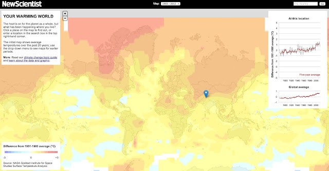
Climate Change - Visualized

Image
New Scientist has put together one of the best visualizations on Global Warming that I've seen You really should play around with this.  You can Pick a 20 year period to look at global trends in that period - from 1893 to 2012 Pick a location to look at the specific trend in that location Drill down into a specific area There is a whole lot more - it really packs a ton of information into a clear and intuitive interface.   (The above is just a screen grab.  Go to the original for the Visualization )  From the writeup on the site This interactive graphic displays results from a global analysis of surface temperatures from 1880 to the present called   GISTEMP , produced by a team at NASA’s   Goddard Institute for Space Studies   in New York City. The graphs and maps all show changes relative to average temperatures for the three decades from 1951 to 1980, the earliest period for which there was sufficiently good coverage for comparis...