Posts

Showing posts with the label UX

Pie Charts - Just Say No
Image
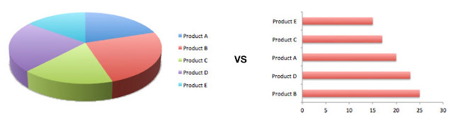
For those who have known me for a while, my antipathy towards pie-charts (and donut charts!) should be nothing new FWIW, it’s not something off the cuff - pie-charts are,  almost always  better off being replaced by something different (bar graphs being the obvious replacement). Why? Because Quantity is represented by angles and humans are   VERY   bad at identifying differences in angles (87 °   vs 82 ° ? Labeling slices ends up confusing stuff even more Small percentages (which might be important) get goofy Anything above 2-3 items in the pie chart are crazy difficult to figure out Don’t get me started on donut charts, that just take all of the above, and make it Even harder to deal with And it’s not just me, Stephen Few ( Perceptual Edg e. Think “grandmaster of all things Visualizaion”. Hell, he, literally, invented the  bullet graph …) wrote the definitive “ DO NOT USE PIE CHARTS ” article back in 2007. And yeah, if you don’t feel like reading the whole...

Three (more!) Dimensions of UX

Image
Say you’re building something completely new and different, which can leave users feeling anxious and/or confused. How do you introduce it to the user, and get the user actually, well, using it? It’s a good question, and particularly relevant in our current world, where we are constantly being bombarded with information, with the volume and content thereof being ever-increasing. Mind you, the fact that we spend our days hunched over a computer and/or a phone doesn’t help at all — if anything it only emphasizes the sheer amount of cognitive load that we all live with on a day to day basis. In this environment, the last thing you want is to add anything to this cognitive load. As product developers, succeeding in this world involves either outcompeting the others, or making life easier for your users. Assuming that you  aren’t  in the business of being evil (please please don’t be evil!), your approach towards UX should focus on ensuring that the users  know  t...

The Subjectivity of User Satisfaction

Image
A friend (call her Alice) shows up at our local pub everyday at 6pm and has a glass of Albariño. It’s like clockwork, to the point where the bartender (Bob) pours a glass out around 5:58, so that it’s ready for Alice when she shows up. The fun part here is that every now and then, Bob pours out something  different —  say, a Vermentino, or a Pigato, or some such — and Alice is quite OK with this. The reasoning being • The “fuzziness” around a routine : Alice likes a little variety. Not too much, but every now and then, mixing up the wines gives her a little jolt of satisfaction. Doing the same thing over and over may be efficient, but it can also remove some of the color from life. Deviation from the mundane can make life just a little bit more happy. • The lack of self-knowledge that we all have : Alice used to think that she only liked Sauvignon Blanc, till she accidentally had an Albariño, and now she’s hooked. Sometimes you need to be thrown a curve-ball to waken you to ...

A Special Place in Hell

Image
/via http://turnoff.us/geek/welcome-to-hell/ I mean, I get it. You’ve got a complex application with a whole bunch of retained state that you don’t want to blow away if the user hits the back button. Except…you don’t. Really. In most (all?) cases, disabling the back button is a sign that • you haven’t thought the problem through, and/or • you didn’t have the time to implement it correctly and/or • you couldn’t figure out how to implement it correctly. And yes, I’ve heard the “ the application is way too complex ” argument too. Over and over again at that. The back-button needed to be disabled because • User information — name/address/… — was being collected on sequential pages, with the back-button blowing away information that was already entered (no it wouldn’t) • Shopping carts would get out of sync (no they wouldn’t) • Submitted information would get re-submitted (no it wouldn’t) and so on.  In every single case , we figured out that the application may indeed ...

Why does it need to be Configurable?

Image
So, you’re building a widget, for example, a temperature sensor. Do you display the temperature in ℉ or ℃? The answer, of course, is “it depends” • You might be able to get away with a switch that toggles the display between ℉ and ℃. • OTOH, If this is going into an airport, with travelers from around the world, you might want to display both And so on. The point being, the amount of configurability that you throw into this depends entirely on what you plan on doing with it, the  requirements  for your widget. After all, the switch, while effective for home use, is actually counter-productive for airport use, no? And that brings us to the User Experience. When you’re building out  any  UI, be it the simple widget above, or something far more complex like a online trading system, you  have to approach configurability from a UX perspective! The vast majority of UI out there falls into one of the following two traps 1.  Feature Overload : The us...

The UX of Date Entry

Image
/via http://turnoff.us/geek/annoying-software-3/ This one really gets my goat. Yes, I know, UX is hard etc. etc., but even a little bit of googling will come up with  some core principles for date entry . And of these principles, the one that should stand above all (for me at least!) is that  you should not require users to enter special characters to format dates. Oh, if you want to show people a greyed-out  / , that’s fine, go for it. But  making  them enter it? Ugh!

Resolution Hell

Image
/via https://www.monkeyuser.com/2016/development-platforms/ When it comes to browsers, I’ve always found the “Too many display formats on Android” argument to be somewhat humorous, because, compared to the living hell that is doing anything on PCs/Macs Android is a bit of a walk in the park. For good or for bad, people tend to swap their phones out somewhat frequently. Ok, maybe not every year (cough), but you’re unlikely to find 5 year old phones out there. But theirPCs? Boy Howdy. Seriously, it’s not just that you can still find low-rez laptops for sale today, it’s that if you find somebody using a five year old PC,  it’s not even surprising! . And life gets even more entertaining when it comes to corporations, where they don’t just have geriatric computers, they even mandate fun stuff like “ Everything must work with IE11 ”. IE11! Which, the last time I checked, doesn’t support CSS Grids, PWA, and most other things that are —  finally!  — making for actually cool/usefu...

Interactive Visualization — the Why

Image
/via https://www.slideshare.net/tgwilson/waw-sep2010-datavisualizationwithnotes Is your Visualization effective? Yes, yes, this is a totally loaded question. After all, WTF does “ effective ” even mean? Well, if you’re using it to understand data, did it work? OTOH, what if you’re trying to explain it to somebody else? You may have to make it easier to comprehend, or more accessible (you’re not color-blind, but what if they are?), etc. And how do you make sure that in doing so for Bob, you didn’t foreclose the ability to explain it to Carol (who, unlike Bob,  really  sweats the small stuff). The common point underlying the above is — “ Why do I, the end-user, give any f**ks about this? ”. And that tends to be issue. Static visualizations, by their very nature, represent a single viewport into the data, the one baked into it’s current representation. And that’s where  Interaction  comes in. An interactive visualization changes the lens with which the data ...

Deep Learning Meets UI/UX

Image
It may be the rage, but good gods, the UI/UX around developing stuff for ML/DL is teh sux0r. It’s all about reams of code, rsync-ing training sets, squinting at charts, and so forth, all in all a throwback to the days of yore. Enter  lobe.ai , where they are building visual tools to help build and train Deep Learning models. As shown above, you start with a “drag-and-drop” scheme, and move on from there, by interacting with your training set, hooking up different models, and visualizing the activation (training progress. This is  seriously  nifty!) in real time. Best of all, it’s all TensorFlow/CoreML/Keras underneath— you can go in and mess with them directly once you’ve got your baseline up to scratch, thus avoiding the (usually  very  painful) process of getting everything setup Just Right. Whats more, once you’re done you can export your models right into TensorFlow/CoreML and move it into whatever system you’re building (or use it  in situ , ...

“Is It Up?” vs “Does It Work?”

Image
There is a world of a difference between  “It’s up”  and  “It works” .  I could go on about this for hours, but, it basically boils down to your customers — they care about the quality of the experience, and  only  the quality of the experience. It may be up as far as you’re concerned, but if interacting with it sux, well, from the customer’s perspective, does it actually work?   Take the above comic. Your implicit assumption might be something like “ It’s a stupid UI ” or some such. Much as we’d like to blame everything on the poor folks in UX, it really could be as much about poor performance aspects, you know? Think of all the times that you’ve hit “Submit”, and gotten back a server error, searched for something with no result when you  know  it’s there, and so on. You need to make sure that  those  aspects of the Customer Experience are covered, as follows — • Request Rate  (aka “ Does it scale? ”): How many reque...

Autocomplete Is Awesome

Image
/via http://geek-and-poke.com/geekandpoke/2014/9/13/simply-explained Well,  is  Auto-Complete awesome? Lets look at it, starting with the above Things that are hard to spell : Take my name for example — “ Paolini-Subramanya ”. The way I spell it is “ P. A.O. and a whole bunch more ”, which is just about sufficient for the restaurant to look up the reservation. Saving on Typing : And, conversely, when they’re taking my name down at the hair salon (for a  beard trim . have you  seen  my head?), it’s again just about the same. The first time around, though, involved around 2 minutes of chaos, including me finally typing in my own name. Improve Suggestions : Ok, now we’re getting into Search, but this can really help, especially when the user doesn’t really know what they’re searching for. Decrease Negative Results : More Search, but this time around decreasing the amount of un-necessary, irrelevant, (and sometimes  wrong ) results that you get. This...