Air pollution worldwide - Visualized
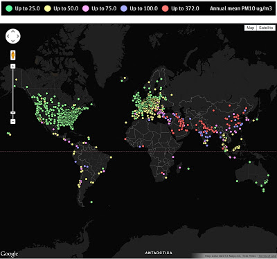
The Guardian took WHO's data on air pollution across the world and created a pretty nifty interactive mashup (using Google, of course).
You can drill down to quite some detail, but IMHO, the "global" view is much more striking. There is really not that much good news from India and China, but the middle-east's numbers are really quite striking (and depressing).
These are just screen-grabs, go to the original for the full mashup...
You can drill down to quite some detail, but IMHO, the "global" view is much more striking. There is really not that much good news from India and China, but the middle-east's numbers are really quite striking (and depressing).
These are just screen-grabs, go to the original for the full mashup...


Comments