Posts

Showing posts from December, 2013

Dangerous Sports - a #Visualization

Image
Ok, we're not actually talking about the really  dangerous sports, like tiger-tipping , delayed-parachute-opening , and East-River-swimming . This, via the Guardian , is the incidence of head-injuries in various sports.  Who knew that water-sports where this dangerous?

Our Race-Neutral Justice System (yes, that is Sarcasm)

Image
Here be statistics from a recent report - The War on Marijuana in Black and White  from the ACLU. Percentage of Whites vs Blacks that have used Marijuana in the last 12 months - roughly the same, with Blacks taking a slight lead. Percentage of Whites vs Blacks that have  never  used Marijuana - roughly the same, with Blacks taking a slight lead again. Arrest rate,  per 100,000  for marijuana possession -  NOT  roughly the same. Not even close. Arrest rates  per 100,000  by region - yup, its nationwide. Break the same damn thing down by county -  virtually all the counties  have Blacks arrested 3X more than whites, with a whole bunch in the " greater than 7 " category. Is this race-neutral justice? Screw "race-neutral" - is this  JUSTICE ? No it isn't - and Ta-Nehisi Coates puts it best The years between 2000 and 2010 do not simply constitute a war on marijuana, but a war on black people who use marijuana. A rising wave smashes Negroes

Places I am boycotting

Any place that calls itself a Shopp e  (and definitely say no if it is shoppé or worse - shoppè ) Likewise with Atelier .  Pretentious much? Restaurants that serve proteins . Its meat buddy, meat ! And, preferably, some specific kinda meat, like beef, or chicken, or lamb (oh yes! lamb! Mmmmm!).

Congressional Ideology since 1857 - a #Visualization

Image
via C hristopher Ingraham , we have this interactive visualization of Ideology (and party unity) in the House from 1857 to 2011 . It was created by  Christopher Ingraham . Data from  Voteview.com . Inspired by work by  Brian Resnick, Brian McGill and Ella Krivitchenko of the National Journal . All together now -- this plot combines data from the  party unity graph  and the  graph of dw-nominate scores . The bottom line - its pretty much always sucked, it just sucks a lot harder nowadays...

#DrWho - the Animated Gif

Image
Because, Doctor Who...

Sorting Algorithms - a #Visualization

Image
via Panthema , we have The Sound of Sorting   where the author both  visualizes  the algorithms internals and their operations, and  generates sound effects  from the values being compared 15 of these algorithms are collected in the following video with appropriately brilliant sound effects.  Check it out!

Paddington Bear - The Movie

Image
now with extra Colin Firth goodness! Except that I've got to wait an entire year.  Sigh... "Please look after this bear" :-)

Problem Solving - a #Visualization by Country

Image
via @peerstr I don't buy India (a call-center might be more relevantly stereo-typey?) but Ireland and the USA are brilliant

The Moustache of Understanding "Monetizes his closet"

Image
Will wonders never cease? Just when you thought that Thomas Friedman could not possibly get more tone-deaf, he one-ups himself, and puts forth a dazzler, a gem, a masterpiece  like today's exercise in awesomeness - " Monetizing your closet " We first have Tracy DiNunzio extolling the wonders of Tradesy “We have a section on the site for wedding attire,” she explained. “We have seen three brides wear the same dress.” The first bought a Vera Wang wedding dress for $8,000 and then sold it on Tradesy for $3,000. The second wore it and resold it for $3,000. “So the bride in the middle of that trade wore her $8,000 Vera Wang wedding dress for free.” ... “For those at the cutting edge of this trend, durable goods are viewed as temporal objects to enjoy and pass on rather than ‘belongings.’ Personally, I no longer feel like I ‘own’ anything. I enjoy my consumer goods for a day, a week or a year, take good care of them because I assume they’ll go on to have another life wit

Practicing Safe Computing - Xmas Gifts Edition

Image
This showed up as an Xmas gift from a random Chinese company. It is safe to use, yes? I mean, its an *Xmas* gift and all?

The Wolf of Bedford Falls

Image
Martin Scorcese's take on Its a Wonderful Life ...

"50 Shades of Grey" - as read by Gilbert Gottfried

Image
" Oh shit this is hot " (via The Tubes of You )

Honest Mistakes - Episode #624

Image
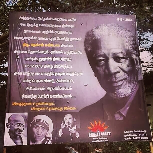
So, this dude in Coimbatore wanted to honor Mandela, and puts up a billboard ... Mistakes happen, right? via @Samanth_S

Well, I guess *that* explains it!

Image
SMBC  - on the origin of species trousers

English! Its Awesome! ("Skosh" Edition)

Image
Etymology From  Japanese   少し  ( sukoshi ,  “ a little bit ” ). Pronunciation ( US )   IPA ( key ) :  /skoʊʃ/ Audio (US) MENU 0:00 Noun skosh  ( plural   skoshes ) A tiny amount; a little bit;  tad ;  smidgen ;  jot . He added just a  skosh  of vinegar, to give the recipe some zip.

Wind on Earth - a #Visualization

Image
From Cameron Boccario comes this stunning visualization of the winds on earth - jet streams and all , based on the Global Forecast System ( NCEP / USNWS / NOAA ), and is updated every three hours Its gorgeous - and beats the heck out of the staid map up above - check it out !

ATMs worldwide - a #Visualization

Image
via The Guardian , here is a very nifty map showing the distribution of ATMs worldwide . Surprisingly, Brazil and Russia have the most ATMs per person, w/ Brazil having the most ATMs of any country. And then, of course, there are any number of countries where ATMs barely exist. As they put it If you're unsure what an ATM is, there are three possible reasons why: 1) you're from one of the 66 countries where there still aren't any 2) you didn't know that it stands for Automated Teller Machine 3) you're from one of the countries where these devices are known as ABMs (Automated Banking Machine) cash machines, cashpoints or holes in the wall Having 3 ATMs for every 1,000 adults though Moldova tops the street banking list in per capita terms. It's also the country to have experienced the most dramatic change in its ATM supply - as recently as 2004 it had one tenth the number it does now. Russia has also experienced a dramatic change with 1.5 ATMs per 1,0

Transcontinental Air Travel - a #Visualization (from 1929)

Image
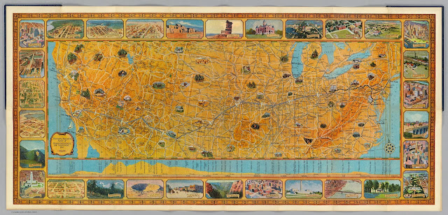
From  Slate - a scan of an old souvenir fold-out map, given to passengers going cross-country via Transcontinental Air Transport  (TAT) in 1929. From the site Despite the company’s name, the trip was not quite transcontinental—as you can see on this map, passengers took a train to Columbus, Ohio, then another from  Waynoka, Okla . to Clovis, N.M. In between, they flew in  Ford Tri-Motor planes  with a capacity of 10 to 12 passengers and wicker seats. Passengers  flew by day  so they could see the sights and  slept on the trains at night . The map’s borders feature scenes of the American landscape, showing places that the passengers could expect to see from the ground (Clovis’ main street) and from the air (the campus of the University of Missouri, Los Angeles’ new City Hall). The trip took 48 hours altogether in ideal conditions. David Rumsey  notes  that on the back of this map, Mason Menefee, the passenger who owned it, filled in his flight log “indicating that weather

The Solar System - a #Videographic

Image
At least, I think  thats the right term. Video Infographic seems too long, no? Anyhow, herewith a quite nifty videographic of the solar system, brought to you by Kurzgesagt

Myrrh? *Myrrh*? WTF is Myrrh?

Image
Penny Arcade calls the three wise-men out - brilliantly

Smart Water (so smart it can solve a Maze!)

Image
Check it out - this is seriously  smart water. No, not the vitamin-enriched wallet-emptier that Jennifer Aniston is hawking - this stuff can figure its way out of a maze. The secret is the Leidenfrost effect - you know, the thing where a drop of water skitters around on a hot-plate. Check out the video below - and if you want to avoid spoilers, go to 1:19.. hat-tip Revolutions Water

Date Formats - a #Visualization (Yes, America is Weird)

Image
via The Guardian , a quick look at date-formats used world-wide. And, as expected, America is the only middle-endian  country. Seriously, WTF?

The Spread of Airplane Borne Epidemics - a #Visualization

Image
Whenever there is an epidemic, there are three basic questions, viz. When is the epidemic going to arrive here (for wherever 'here' is) How fast is it moving? Where did it come from? As Brockmann Labs  puts it We live in a globally connected world. More than 3 billion passengers travel each year on the worldwide air-transportation network and cover trillions of miles of travel. There is no scale to modern mobility. Our global connectivity has reshaped the way that spreading phenomena evolve on the networks that connect us. The complexity of modern mobility translates into a high degree of spatio-temporal complexity of spreading phenomena such as the spread of news, the dynamics of global diseases of human mediated bio-invasion.  The image above shows the most probably path an epidemic will take if it originates in Mexico, and the video below shows the same for Atlanta.  The source paper is A geometric approach to network driven contagion phenomena , and is quite r

Capital Punishment - a #Visualization

Image
via Amnesty International (and The Guardian ), we have the above chart showing the usage of Capital Punishment worldwide. From The Guardian Despite more countries abolishing the death penalty, its practice remains commonplace.   China , together with  Iran ,  North Korea ,  Yemen  and the US (the only G7 country to still execute people) carried out the most executions last year.  So yeah, way to go US...

Every Sports Interview Ever

Image
via Elizabeth Nielsen

Cuteness overload - Otters Edition

Image
An otter retrieving soda from a machine - for you...

Syntax - Why so CareMad?

Image
Mahesh Paolini-Subramanya - Syntax Matters - What Programmers can learn from the World of Linguistics from Erlang Solutions on Vimeo . Syntax tends to get people remarkably upset in the programing world ( semicolons anyone? ), with virtually any introductory talk on Erlang (Haskell, Clojure, whatever) invariably containing a self-deprecatory quote about its Syntax.  The thing people tend to forget is that this isn't new!   Syntax has been upsetting hominids since the first australopithecus said " Urghk " instead of " Oook ", and got righteously thumped for it, and has continued to the present day (check out " French is better than " on Teh Googles ).   Whats worse, people tend to mistake Syntax for Semantics , resulting in both chaos (and torture. Seriously). I gave a rant talk on this topic at CodeMesh  a wee bit back. The video is above, and the slides below. Syntax - Why so CareMad? from Mahesh Paolini-Subramanya Remember

Rocky Movies - a #Visualization

Image
via Fathom Information Design , we have this complete breakdown of all the Rocky movies (including the excruciatingly bad/awesome Rocky-IV).  From the description It wouldn’t be a Rocky movie without an epic montage, a good and bloody fight, oh and some dialogue, too. There are, in fact, only a few basic narrative elements that make up the formula for all six Rocky films. Using empirical data collection (i.e. watching the six movies over six days straight), Rocky Morphology analyzes the Rocky series in order to identify its key narrative elements. It’s interesting to see the battle between dialogue, montage and fighting throughout each film. Dialogue beats out training and fighting in the first two Rocky films, but fighting and montage occupy the most time in  Rocky III and  Rocky IV .  Rocky V  favors dialogue over fighting — undisputedly slowing its pace next to the previous films. In the final round, Rocky sticks with dialogue over fighting but —  “it ain’t over ‘till it’s o

Corgi Carousel. That is All

Image
Seriously. Its a Corgi. On a carousel. Running. You need something else?

Conspicuous Consumption - Exhibit #713

Image
Herewith Paolo Costagli 's " Sterling Silver and 18K Gold Vermeil Bell Pepper Salt Cellar Set With Diamonds " (Because lord knows they would suck without Diamonds) Mind you, as a bonus, they Revisit Paolo Costagli's childhood treasure hunts for the most uniquely shaped fruits and vegetables at his family villa in the Tuscan countryside. Come the revolution, I suspect at least one jeweller stands an even chance at being first in line... Incidentally, I wonder if Paolo hunted for this uniquely shaped lemon at his family villa, and if so, when they'll show up as precious jewellry...

Author's Temperaments - a #Visualization

Image
Jimmy Chen plots Artists on an Arrogance-Genius scale, and comes up with the following. Me, I think he is being way  too kind to Ayn Rand...

Fluids - a #Visualization (in ASCII!)

Image
by Yusuke Endoh . Because some people clearly have way  too much time on their hands

Sigh. More Vaccination Idiocy - Katie Couric edition

Image
In case the news passed you by, Katie Couric (who is, supposedly, a journalist. Could-a fooled me) has thrown in with the anti-Vaccine crowd.  This was the lede for her Wednesday show The HPV vaccine is considered a life-saving cancer preventer, but is it a potentially deadly dose for girls? (The answer, by the way, is NO , in case you were wondering) Lo and behold, it turned out to be a very Fair and Balanced take on this issue.   Amanda Marcotte has a complete take-down at Slate , and I won't get into that, but over at Lawyer's, Guns and Money, Dave Noon has the perfect riposte For at least the ten thousandth time, it’s worth pointing out that “debating” the science on vaccine safety and efficacy is about as fruitful or necessary as debating the veracity of the moon landing. Perhaps next week, Couric will host a thoughtful discussion on children’s dental care. Yes, she encouraged her own children to brush their teeth several times a day, but  some people have concer

Flight Delays - a #Visualization

Image
FlightAware (the flight tracking people) has pulled together a Misery Map , which shows you the current state of air-travel in all your favorite US airports. Click on the donuts to see on-time and delayed flights. The seriously cool part is that you even see the weather underneath the tracks - possibly helping you figure out when you're being bullshitted...

"Personal Branding" - Just Say No!

Image
The next person to mention “Personal Branding” to me stands an even chance of watching me batter my head against a wall till I pass out. Seriously. Do you know of any brands that are "Sincere"? Better yet, think of the word "branding" - whats the first thing that comes to mind?  Odds are it had something to do with Snake Oil, Shills , and/or Insincerity. In fact, the whole point of most branding exercises tends to be about getting you to do something that you don't really want/need/must do - think "paying for bottled water", or "eating at MickeyD's", or something equally horrific. So why, why  should your exercise in " Personal Branding " result in anything other than mockery, sarcasm, or my battering my head against the nearest wall till I pass out?

Traffic Waves - a #Visualization

Image
Lewis Lehe and Matthew Greene over at KQED have a complete description of traffic waves, and a sweet visualization to go with it. The simplest explanation for why traffic waves happen is that drivers have relatively slow reaction times: if the car in front of you suddenly slows down, it’ll likely take you a second or so to hit the brakes. The slower your reaction time, the harder you have to brake to compensate and keep a safe distance. The same goes for the car behind you, which has to brake even harder than you did in order to slow down faster. And so on down the road, in a domino-like effect. To illustrate this concept, programmer Lewis Lehe, a civil engineering graduate student at UC Berkeley, created this visualization. Select a car from the bunch, click “Hit the Brakes” to slow down your highlighted car, and then wait until a traffic wave forms. The red bars represent deceleration levels (braking) and the green,  acceleration (speeding up). Mouse over a car to slow every

Code Refactoring

Image
Heck, any  kind of refactoring...

Public Radio's Reach in the USA - a #Visualization

Image
Andrew Filer has pulled together data from the FCC and Wikipedia to chart the reach of public radio in the USA  ( Its quite nifty - check it out !

Caffeine Delivery Vehicles - a #Visualization

Image
via The Guardian (of course), you have these charts showing the amount of caffeine per 100mg (and per serving!) in Tea, Coffee, Soda, etc. The - somewhat surprising - result?  For maximal caffeine, go with  chocolate coated coffee beans ! Makes sense in retrospect though... And below, the same numbers but done per serving...

The top Reddits of all time - a #Visualization

Image
via James Trimble @ UK Data Explorer , we have this complete time-suck of an interactive Visualization, which goes through the top Reddits of all time , grouped by category.