America - Visualized as a Racial Dot Map
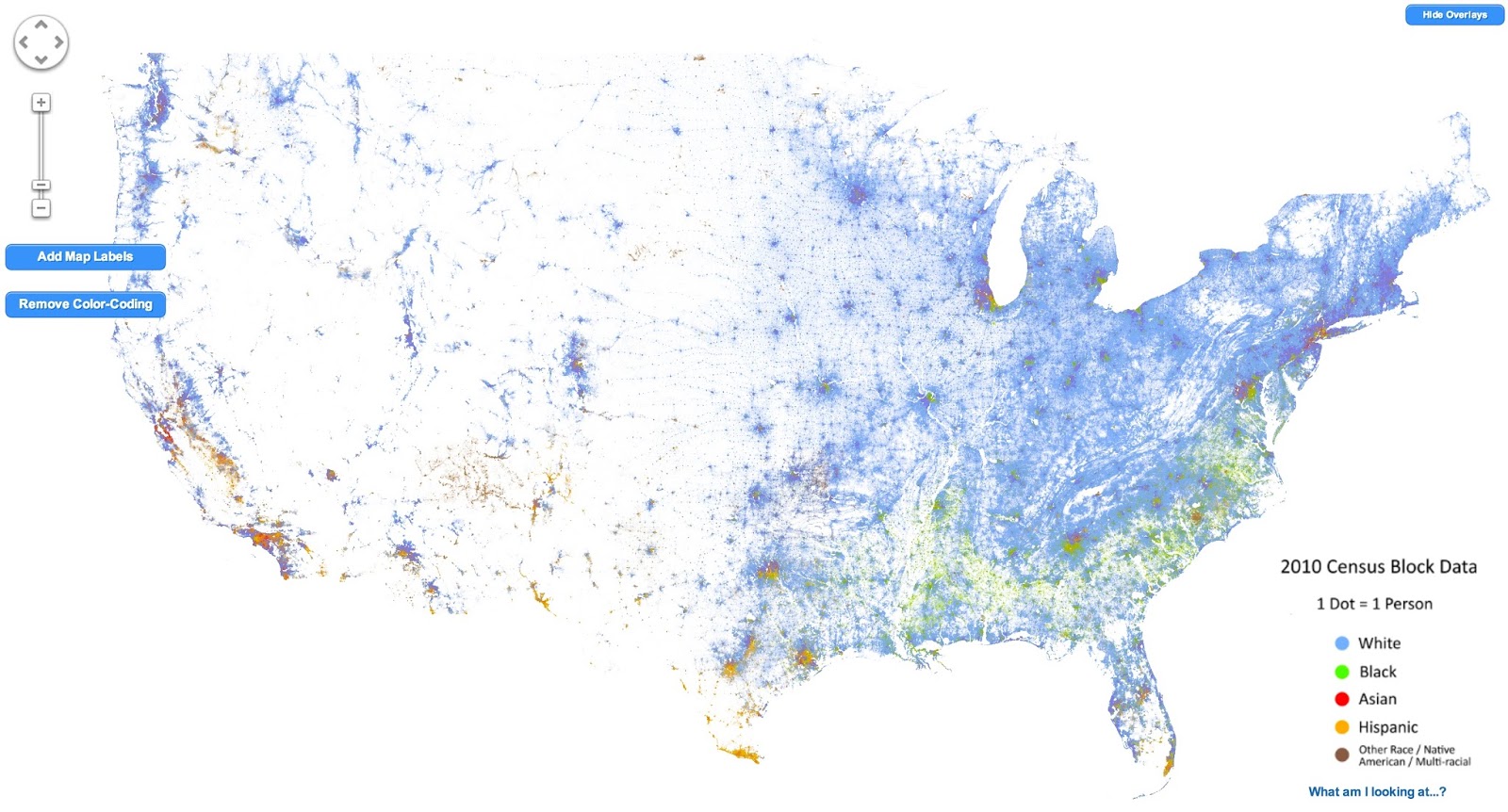
Dustin Cable does the honors here - mapping the population of the USA as a dot-map. Literally a dot-map, as in one dot per person. This is not unlike the original dot map, but the coloring provides a racial breakdown.
I still find it fascinating how pretty much the entire Western USA is empty...
Anyhow, as he puts it

I still find it fascinating how pretty much the entire Western USA is empty...
Anyhow, as he puts it
This map is an American snapshot; it provides an accessible visualization of geographic distribution, population density, and racial diversity of the American people in every neighborhood in the entire country. The map displays 308,745,538 dots, one for each person residing in the United States at the location they were counted during the 2010 Census. Each dot is color-coded by the individual's race and ethnicity. The map is presented in both black and white and full color versions. In the color version, each dot is color-coded by race.The below is a screen grab, go here for the original interactive version
All of the data displayed on the map are from the U.S. Census Bureau's 2010 Summary File 1 dataset made publicly available through the National Historical Geographic Information System. The data is based on the "census block," the smallest area of geography for which data is collected (roughly equivalent to a city block in an urban area).


Comments