Posts

Showing posts from August, 2013

Australian Skilled Immigrants vs Refugees - Visualized

Image
The Guardian (of course. who else) has put together this remarkably nifty interactive map showing where Australia's skilled immigrants and humanitarian refugees are coming from. Take a peek. a b c

The Dark Notebook Rises (Batman ❤s Bane)

Image
This is wrong. This is so very wrong.

Craft Beer - Jumping The Shark Edition

Image
Submitted without comment...

Sweden - The Future (Late 80s version thereof)

Image
Simon Stålenhag has a series of paintings that he has done of the Sweden of the future, as perceived in the 80s.  Its all deeply inspired by the sci-fi of the time, and is eerily familiar - both from a Star-Warsian perspective, and from a " this is what the world is really like " perspective. Exhibit A below - the pit-stop :-) There is a whole bunch more in this vein.  The kids playing in the snow or the scummy pond its haunting, and eerily familiar. Go check out his site for more examples , and maybe, buy something...

Sandwich fillings - Visualized

Image
This highly un scientific study by The Guardian   does two things, and does it very well. It shows the most popular fillings for sandwiches (thankfully, Vegemite doesn't make the list). Much more importantly, it finds out a) there is a strong correlation between structural integrity and number of ingredients b) there is a weak correlation between deliciousness and number of ingredients c) there is no  correlation between deliciousness and structural integrity!  Who knew! In short, yay for science! Note: Re: the science above   The correlation coefficient, r, measures the extent of the correlation between two variables. Values of 1 or -1 are strong, and values closer to 0 are weaker.

Earthquakes since 1898 - Visualized

Image
This one comes to you courtesy John M Nelson . Its fairly straightforward - showing all earthquakes since 1898, by magnitude. And - surprise, surprise - its a pretty good map of the continental plates :-) (Check out the Ring of Fire ) by johnmnelson . Explore more infographics like this one on the web's largest information design community - Visually .

Every Protest since 1979 - Visualized

Image
Did you know that there is a thing called the Global Database of Events, Language, and Tone ?  From the site, The Global Database of Events, Language, and Tone (GDELT) is an initiative to construct a catalog of human societal-scale behavior and beliefs across all countries of the world over the last two centuries down to the city level globally, to make all of this data freely available for open research, and to provide daily updates to create the first "realtime social sciences earth observatory." Nearly a quarter-billion georeferenced events capture global behavior in more than 300 categories covering 1979 to present with daily updates. In short, a daily aggregation of new sources worldwide, since 1979. Epic scale  doesn't even begin to cover it. As you might imagine, this allows for all sorts of visualizations (that is  the point after all!), and John Beiele r has been doing some remarkably nifty work in this arena. His Protest Map is pretty amazing, mapping

Anti-Vaccination Idiocy - Texas Edition

Image
Remember last year when Indian had the measles thingy ? And before that, when in 2005 they had another  measles epidemic ?  All because a bunch-a idiots of the Jenny McCarthy vein decided that science was for shit?  Well, guess what - it happened again, in Texas this time.  From Forbes A measles outbreak in Texas traces to a congregation of a megachurch whose leader,  Kenneth Copeland , reportedly has warned followers away from vaccines, advocating for faith healing and pushing the debunked notion that vaccines cause autism. One of Copeland’s churches, Eagle Mountain International Church in North Texas, is the epicenter of the outbreak, which now has hit at least 20 people Just as Wales is  paying the price  of the autism-measles vaccine panic begun 15 years ago, so is this Texas community. In the wake of the outbreak, the church’s pastor and Kenneth Copeland’s daughter, Terri Copeland Pearsons, was  urging congregants  take advantage of a couple of free vaccination clinics the

So you want to be an Architect?

Image
Sheldon has you covered ...

The Essential Cat

Image
Scott Kurz nails this one at pvp-online

Mahesh's Twentysecond Law - Airline Salt-shakers

Image
It doesn't matter how cool it looks, the salt-shaker on a plane will not dispense salt. Corollary The pepper thingy doesn't work either. Note Its probably some kind of travel regulation. For your edification Air Berlin

The Social Graph of Movie Characters - Visualized

Image
From Movie Galaxies , we have this graph-oriented view of movie characters. As infosthetics puts it, Based on each movie script, all the interactions of the main characters are aggregated, analyzed and represented as an interactive network graph. Each character is represented by a single network node, which is sized accordingly to how connected the respective character is with others. In turn, each color represents a unique cluster of a given character. As a result, the collection of movies can be explored by their 'density', 'clustering' or 'diameter'. The below are screen grabs, go to the site for the actual (interactive!) version

Hurricane-Proofing your house - an Infographic

Image
Ok, its from a company that has something to sell ( Doors, and More ) but what the hell, its still a pretty nifty infographic . Mind you this may not Play well in Peoria, but it certainly does have Relevance in Roatan (or New Orleans, though that itsn't alliterative) (Also, my favorite part - Have a Can-Opener! )

Sexual Intercourse & Coffee

Image
Herewith two charts - both from ChartsBin , one showing average age of first sexual intercourse , and the second showing coffee consumption per capita . There is a clear correlation no? So what is the causation? Does more coffee consumption result in sex at an earlier age? Or is it the other way around? Enquiring minds want to know... via chartsbin.com

Most "Pause"-ed moments in Movies

Image
Brought to you by the good folks at WatchMojo (An erection in The Little Mermaid? Really?)

Mahesh's Twentyfirst Law - Mature Technologies

Image
Any sufficiently mature technology will be independently rediscovered Corollary Software development is the art of reinventing the wheel, and more importantly taking credit for it ! Corollary 2 Re-invented wheels are invariably much suckier than the original Note This is reaching epidemic proportions in the software industry.  Particularly humorous (or grotesque?) are the fields of Fault Tolerance (Its called Erlang . Go look it up), and Active Queue Management (Kathleen Nichols and Van Jacobson. If you don't know the names, you shouldn't be messing with queues)

Metric System Usage - Visualized

Image
Ok, this is actually Where the Metric System is NOT  used . It is good to know that we are in such august company. (Also, FWIW, I still don't know how many bhp there are in an oz.)

Vice in 1885 San Francisco - Visualized

Image
From Mapping The Nation , comes this map of 1885 San Francisco, which, in gory gory detail, is  a lengthy report of the city’s Board of Supervisors, and is one of the earliest examples I have seen of a map designed to identify the distribution of ethnicity and vice (prostitution, gambling, and opium “resorts” or dens) [...and...]  the map represented a new form of knowledge, ordering and making intelligible “the heretofore impenetrable and labyrinthine geography of Chinatown.”   [...] The map–like the accompanying report–takes care to separate white and Chinese prostitution. The Board of Supervisors argued that white female prostitution had grown with the arrival of the Chinese in the city, for Chinese men were the primary patrons of white prostitutes [the Board observed a similarly offensive trend of white women living with Chinese men]. The map also drew attention to the many “Joss houses” of the city — houses of Chinese folk worship which the Board deemed idolatrous and only serv

Lands Discovered by Europeans - Visualized

Image
Herewith a map showing all the lands actually discovered by Europeans . Surprising exactly no one, its basically a list of every damn ennsy-weensy island out there. If it was large, there were humans there already. Mind you, they were  "discovered" by the Europeans, in the sense that you "discover" peanut-butter and riracha sandwiches. Everyone " discovers" this at some point.  Its just that you don't really get to claim it for yourself :-) (hat-tip Radical Cartography ) (click to embiggen. A lot )

Pie Charts - Visualized (With Pies!)

Image
Seriously - Pie Charts for Math Nerds from Hannah Hart and Josh Sundquist That is all. (hat-tip Nathan Yau )

The World - Visualized via Spirographs

Image
From Rachel Evans , we have this labor of love (and spirograph). Mind you, if you so desire, she has Daleks too :-) (A video of her doing this below...)

Humor in Park Places

Image
via Wes & Tony at Amazing Super Powers

Big Wheel - For Adults!

Image
Yup. From High Roller we have the (at this point) one and only High Roll Adult Size Big Wheel Drift Trike For one easy payment of $599.99 Details, and video, below Patent Pending Steel Frame and Fork Custom metal flake glossy paint Molded 14 inch Plastic Rear Wheels for Power Slides and Drifting! Pneumatic 26 inch front wheel Freewheel Hub for high speed coasting Alloy Rims Super Wide front tire for super traction Alloy V-Brake and levers Plush, Fully Adjustable seat Bell and Tassels, because who doesn’t love tassels

Everything is better with What?

Image
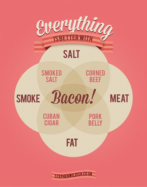
Stephen Wildish has the answer to that age old question - Why Bacon?

Beans - Visualized

Image
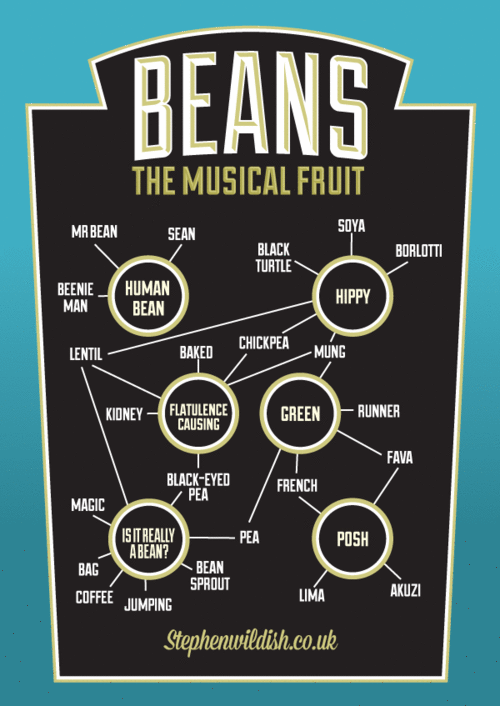
Stephen Wildish brings it to Beans, with predictably hilarious results

iOS6 vs iOS7 vs Android - Visualized

Image
PortKit takes care of it all . I'll let them say it PortKit shows you each Cocoa UI Element in iOS 6 / iOS 7 and its Android widget version, side by side, so you can compare and find the correct equivalent when porting an app. We are a Brisbane based company that develops iPhone & iPad Apps  and  Android Applications  and we wanted a simple way to visualise, reference and compare UI elements, and have quick access to documentation and the respective naming conventions. Due to the popularity of this post we decided to add a tonne of handy resources, tools, and tips that we use day to day available at the bottom of this post. Just go check it out - its pretty damn impressive... (screencap below..)

America - Visualized as a Racial Dot Map

Image
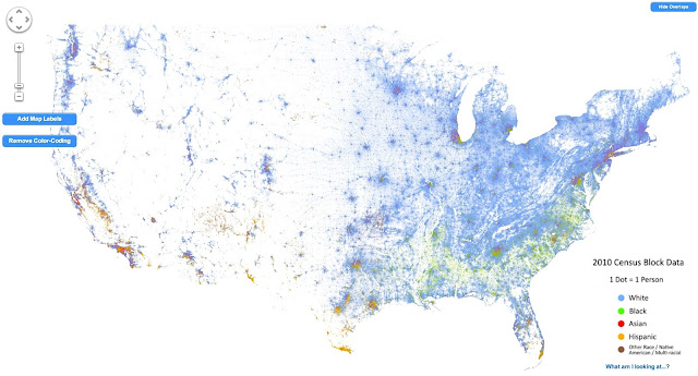
Dustin Cable does the honors here - mapping the population of the USA as a dot-map. Literally a dot-map, as in one dot per person .  This is not unlike the original dot map , but the coloring provides a racial breakdown. I still find it fascinating how pretty much the entire Western USA is empty... Anyhow, as he puts it This map is an American snapshot; it provides an accessible visualization of geographic distribution, population density, and racial diversity of the American people in every neighborhood in the entire country. The map displays 308,745,538 dots, one for each person residing in the United States at the location they were counted during the 2010 Census. Each dot is color-coded by the individual's race and ethnicity. The map is presented in both black and white and full color versions. In the color version, each dot is color-coded by race. All of the data displayed on the map are from the U.S. Census Bureau's 2010 Summary File 1 dataset made publicly available

Baby names in England and Wales - Visualized

Image
The Guardian does the heavy lifting again - using the data from the Office for National Statistics to map this. Learn About Tableau

(Probably not) The last word on the NCAA

Image
Josh Levin has a fairly searing take on the NCAA over here , where he points out - for quite probably the eleventieth time - the essential unfairness of the system.  This time around he points out the eery similarities between the NCAA and prison economies, with the following lines being particularly powerful.  And horrifying (emphasis mine)  “Student-athletes earn free tuition, which over the course of four years can exceed $200,000,”  says  Sports Illustrated ’s Seth Davis , who gets a nice paycheck to gab about unpaid laborers. “They are also provided with housing, textbooks, food and academic tutoring. When they travel to road games, they are given per diems for meals.” What Davis  and others  don’t seem to understand is that money is the only thing that’s money . Google employees get a free shuttle to the office, free food in the cafeteria, a free on-site gym, and  free continuing education classes . They also get salaries, because paying people in perks is illegal for e

The DrWho timeline as a Tube Map - a #Visualization

Image
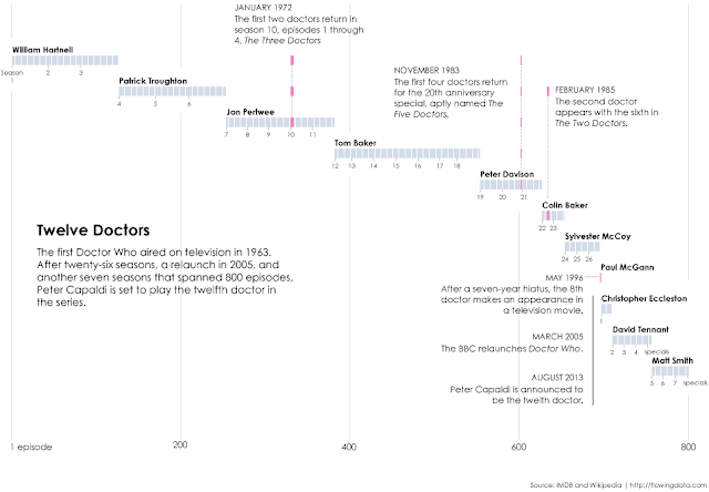
Crispian Jago puts together the entire Doctor Who timeline as a tube-map, and does a pretty spectacular job of it at that. The below is a simple cut-and-paste - go to the original to check it out!

The Incredible Exploding Truck!

Image
Just when you think its stopped exploding - it'll explode again! Step right up folks - 'cos you ain't seen nothing like it!

Red Hair in Europe - Visualized

Image
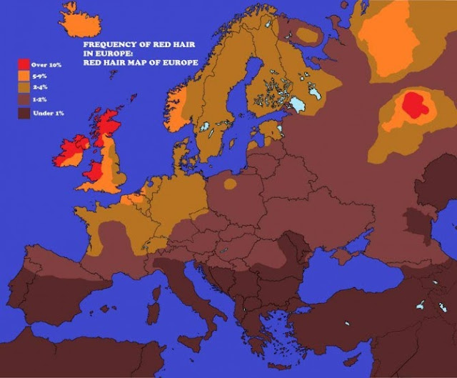
At Planet Ivy , James McInerney puts together a a nice map showing the occurrence of red hair in Europe .  Pretty much as expected, except, where did that Russian enclave come from? Incidentally, if you've wondered about red hair's genetic origins, The phenotypic manifestation of Red Hair occurs when an individual has two recessive alleles for the Melanocortin 1 Receptor.  This is a kind of GPCR protein (a type of protein that is usually found embedded in the membrane of a cell and that often mediates the transfer of information from outside to inside the cell or  vice versa ).  The gene for this protein is found on chromosome 16.  In any case, if you have the recessive alleles, then you produce phaeomelanin (a yellow-ish reddish skin and hair pigment) and not Eumelanin (the brown-black pigment).  If you have one recessive allele and one dominant allele, then you won’t have red hair and if you have two dominant alleles you won’t have red hair. Better now, no? Anyhow, it

Doctor Who Actors - Visualized

Image
via Flowing Data , Nathan Yau  shows us the 11 (and soon to be 12) actors who have played DrWho . 800 episodes, including specials and movies - I believe I have seen every single one - admittedly, not counting the ones that have been destroyed...

One Movie Trailer to Rule Them All

Image
ETERNA from Behind The Epic on Vimeo . This, this , my friends, is a movie trailer. If the movie actually existed, it would be exists solely in the fever-dreams of Joel Shumacher and Michael Bay, one that even god could only dream of. Sadly, it is nobbut a mashup put together by Belarusian Vadzim Khudabets. Still, awesome is awesome - check it out... (Screen-grab below - video above)

Road Trips and Beer - The perfect Google Maps Mashup

Image
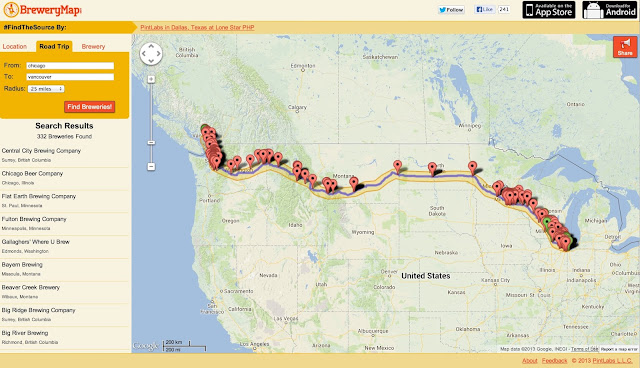
Say you've planned a road trip from Chicago to Vancouver, it'll be fun, you'll get to see The Great State Of Montana (where wild Turners roam), you have your Burrough tapes, life is good. But wait! Where are your precious craft beers? You can't make-do with Miller High-Life, right? Fear not - BreweryMap has you covered. Put in your source and destinations, and it'll give you a listing of all the breweries along the way - thus converting your road-trip into a thing of wonder. Go check it out, and enjoy the good life! (the below is a screen grab - go here for the interactive version )